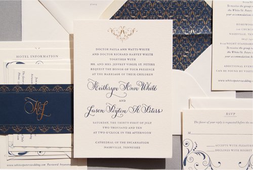
ornate details: 11/15/10

When Katie described her wedding and specifically her reception location I knew that we just had to use gold foil. The photos that I saw of the Hermitage Hotel in Nashville were filled with golden details. We settled on a custom flourish illustration that we were also able to use in larger pieces for the

hitting the road: 10/13/10

Sarah and John's invitation set is one of my favorites from this year. We started out with a bicycle theme and from there we developed a pattern based on the wheels and spokes. The invitation was letterpress printed in chocolate brown while the enclosures were offset printed. Everything tucked nicely into a chocolate brown pouch

muslin bags? check!: 9/22/10

  This wedding was a second marriage for Laura and John so they definitely wanted to include their children in the celebration. The invitation featured a nest with their five chicks and two birds on branches at the bottom. We also incorporated the birds and branches in with a custom monogram for the front of

so exciting!: 09/15/2010

  Working with Sydney and Chad was a treat in of itself - having their wedding and invitations featured in the Fall/Winter 2010 issue of Town & Country Weddings is definitely the icing on the cake! From the beginning Sydney had a clear idea of what she wanted her invitations to look like. We spent

A Warm Reception: 1/4/10

YAY! I have an invitation featured in this month's 5280 Magazine. I was asked to design an invitation for a "classic" winter wedding. The result was an invitation foil stamped in antique gold with a gold wrap on 100% cotton textured paper. images scanned from January 2010 5280 magazine